Making an ascii animation
# July 15, 2025

If you're in the market for a new terminal app, there's a surprising number of options to choose right now. Ghostty's one way to go - authored as a full open source project by Mitchell Hashimoto.1
Ghostty is a minimalist terminal emulator. So is their website: just an animation with a download button. But this animation really caught my eye. It's running at 24fps with proper aspect ratio correction, color-aware filtering, and accurate luminance mapping. And it's all in ascii. Chic.
Thankfully they open sourced the original video and the conversion script so we can see exactly how they did it.
The video
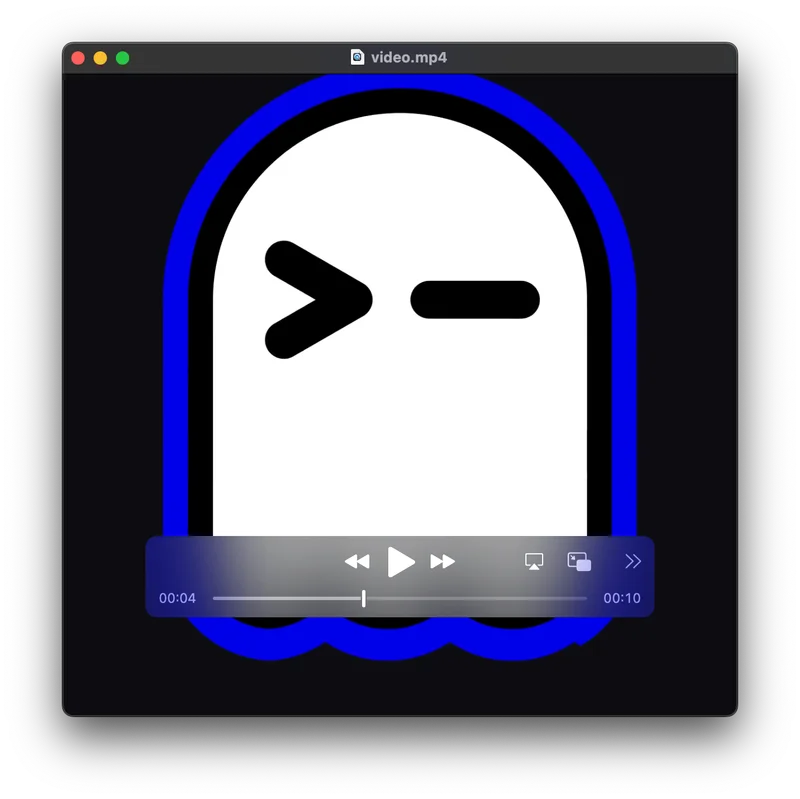
The terminal graphic starts its life as a video file, which is probably no surprise since the ascii animation renders at a high framerate as well. I doubted you'd go through the effort of trying to work up something that sophisticated in a non-animation editor.
Interestingly, the file itself doesn't loop smoothly. The last frame doesn't transition cleanly back to the first frame, so there's a visible "pop" if you just loop the raw video. The website doesn't have this same kind of pop and in fact the checked-in first frame isn't equal to the first frame of the video.
My guess is they're used a cropped version of the video when they actually generated the animation.
Color filtering
Okay, let's look at the conversion script. It's written bash and it's actually pretty short, since it leans on just a few algorithms.
Making "images" in ascii is really just choosing the text that you want in each spot. Negative space (no text) becomes just as important as the positive space where you put text itself. Rather than converting every pixel to ASCII, it uses a distance-based filter to only render pixels that are close to two target colors:
BLUE="0,0,230"
BLUE_DISTANCE_TOLERANCE=90

WHITE="215,215,215"
WHITE_DISTANCE_TOLERANCE=140
How to define "closeness" here?
color_distance_from() {
  awk -v c1="$1" -v c2="$2" '
    BEGIN {
      split(c1, a, ",");
      split(c2, b, ",");
      print abs(a[1] - b[1]) + abs(a[2] - b[2]) + abs(a[3] - b[3]);
    }
    function abs(x) { return ((x < 0) ? -x : x) }
  '
}
They're using Manhattan distance in RGB space. Manhattan distance isn't the most perceptually accurate way to measure color similarity2, but it works great here because the colors are so uniform.
Manhattan distance just adds up the absolute differences between each RGB channel. So comparing (255,0,0) red to (0,255,0) green gives you |255-0| + |0-255| + |0-0| = 510. The maximum possible distance between any two RGB colors is 765 (when comparing pure white to pure black).
This creates a sparse representation where only the most visually important pixels survive the filtering process. The blue represents the border of the ghostty logo elements, while white captures the inner part of the ghost. Everything else (black background and back inner border) becomes empty space that we just won't fill with ascii text.
An aside on luminance
Time for some light color theory. Luminance is the measure of how bright a color appears to human vision. This isn't the same as simply averaging RGB values within some region because in practice our eyes don't perceive all colors as equally bright.
Human vision has three types of cone cells that respond to different wavelengths of light - roughly corresponding to red, green, and blue. But they're not equally sensitive. We're most sensitive to green light, moderately sensitive to red, and least sensitive to blue. This is why a pure green (0,255,0) appears much brighter than a pure blue (0,0,255) even though they have the same "intensity" in digital terms.
The standard formula for relative luminance weights these sensitivities:
L = 0.2126 × R + 0.7152 × G + 0.0722 × B
These coefficients come from the CIE 1931 color space, which was developed by measuring how observers perceive brightness across different wavelengths. The green coefficient (0.7152) is about 10x larger than blue (0.0722), reflecting our much higher sensitivity to green light.3
For terminal animations, this is crucial because ASCII characters represent different visual densities. A . character appears much lighter than a @ character when stacked next to one another, so you want to map dim colors to light characters and bright colors to heavy characters. Without proper luminance calculation, a bright blue might incorrectly map to a heavy character when it should appear relatively dim.
Character selection
Once a pixel passes the color filter, the script maps it to an ASCII character based on relative luminance. The luminance calculation uses those perceptual weighting coefficients from CIE 1931:
pixel_for() {
  local luminance=$(awk -v r="$r" -v g="$g" -v b="$b" 'BEGIN{print int((0.2126 * r + 0.7152 * g + 0.0722 * b) / 1)}')

  local blue_distance="$(color_distance_from "$BLUE" "$1")"
  local white_distance="$(color_distance_from "$WHITE" "$1")"

  if [[ $blue_distance -lt $BLUE_DISTANCE_TOLERANCE ]]; then
    local scaled_luminance=$(awk -v luminance="$luminance" -v min="$BLUE_MIN_LUMINANCE" -v max="$BLUE_MAX_LUMINANCE" 'BEGIN{print int((luminance - min) * 9 / (max - min))}')
    echo "B$scaled_luminance"
  elif [[ $white_distance -lt $WHITE_DISTANCE_TOLERANCE ]]; then
    local scaled_luminance=$(awk -v luminance="$luminance" -v min="$WHITE_MIN_LUMINANCE" -v max="$WHITE_MAX_LUMINANCE" 'BEGIN{print int((luminance - min) * 9 / (max - min))}')
    echo "W$scaled_luminance"
  else
    echo " "
  fi
}
There's a bit of minmax thresholding going on here too. Blue pixels are constrained to luminance values 10-21, while white pixels use 165-255. This ensures that:
- Dark blue UI elements map to "lighter" ASCII characters (
·,~,o) - Bright white text maps to "heavier" characters (
*,%,$,@) - Maximum contrast is preserved within each color category
The final character mapping happens through a series of sed substitutions:
sed 's/0/·/g' \
| sed 's/1/~/g' \
| sed 's/2/o/g' \
| sed 's/3/x/g' \
| sed 's/4/+/g' \
| sed 's/5/=/g' \
| sed 's/6/*/g' \
| sed 's/7/%/g' \
| sed 's/8/$/g' \
| sed 's/9/@/g'
This progression from · to @ represents increasing visual density to effectively represent luminance in a character-based display.
Aspect ratio
Terminal characters typically have an aspect ratio around 0.44 (width/height). Without correction, the animation would appear vertically stretched. The script handles this by pre-squishing each frame:
FONT_RATIO=".44"
local new_height=$(echo "$FONT_RATIO * $image_height" | bc | jq '.|ceil')
magick "$f" -resize "x$new_height"'!' "$squished_image_file"
The ! in ImageMagick's resize command forces the exact dimensions, ignoring the original aspect ratio. This ensures that when the squished image gets displayed using terminal characters, it appears with the correct proportions.
Processing pipeline
This whole processing is handled by ffmpeg. They're effectively just using it as a mp4 to png frame converter, where each frame can then be passed through the ascii conversion pipeline.
generate_frame_images() {
  # Extract frames with ffmpeg
  ffmpeg \
    -loglevel error \
    -i "$video_file" \
    -vf "scale=$OUTPUT_COLUMNS:-2,fps=$OUTPUT_FPS" \
    "$frame_images_dir/frame_%04d.png"

  # Process each frame individually
  for f in $(find "$frame_images_dir" -name '*.png' | sort); do
    # Aspect ratio correction
    magick "$f" -resize "x$new_height"'!' "$squished_image_file"

    # Convert to RGB text data
    magick "$f" "$imagemagick_text_file"

    # Process each pixel
    cat "$imagemagick_text_file" | tail -n +2 | while read line; do
      local rgb="$(echo "$line" | cut -f2 -d ' ' | cut -d "(" -f 2 | cut -d ")" -f1)"
      local pixel="$(pixel_for "$rgb")"
      echo -n "$pixel" >> "$output_text_file"
    done

    # Apply character mapping and HTML formatting
    cat "$output_text_file" \
      | perl -pe 's/(B[0-9](?:B[0-9])*)/<span class="b">\1<\/span>/g' \
      | sed 's/B//g' \
      # ... more transformations

    # Clean up intermediate files
    rm "$f" "$imagemagick_text_file"
  done
}
HTML output
The final transformation wraps consecutive blue characters in <span class="b"> tags for CSS styling4:
perl -pe 's/(B[0-9](?:B[0-9])*)/<span class="b">\1<\/span>/g'
This allows the web page to style blue characters differently from white ones, maintaining the visual distinction that was established during color filtering. The result is HTML that looks like terminal output but can be styled with CSS for better web presentation.
Conclusion
I thought this approach was a pretty clever way to grab some attention for a terminal client. It's certainly different - you barely see ascii on the web these days and you never see ascii video.
If we're really all moving to the terminal maybe that will soon change.
-
You might recognize that last name: he's the cofounder of Hashicorp which makes terraform and a lot of other devops libraries. ↩
-
The gold standard for color distance is Delta E, which measures perceptual color difference. Unlike RGB, LAB is perceptually uniform, so a change of 1 unit should look like the same amount of difference regardless of where you are in the color space. But the math is non-trivial and almost certainly overkill for ASCII art. ↩
-
This incidentally is used frequently in grayscale conversion to preserve the apparent brightness relationships from the original color image. ↩
-
By george! A perl script in the wild. You don't see those every day. ↩